Weebly Tab Headers – Responsive Tabs with Content Displayed Above the Navigation
A unique tab layout for Weebly where the content panel sits above the tab navigation links — no coding required. Drag and drop any Weebly element into each tab’s content area, customise colours from the settings panel, and enjoy a tab widget that stays horizontal on mobile without collapsing into an accordion.
Content Above Tab Navigation | Stays Horizontal on Mobile | Drag-and-Drop Content | 7 Colour Settings | From codoplex.com
⬆️ Content Above Tab Links
📱 Stays Horizontal on Mobile
🗂️ Drag-and-Drop Tab Content
What Is the Weebly Tab Headers App?
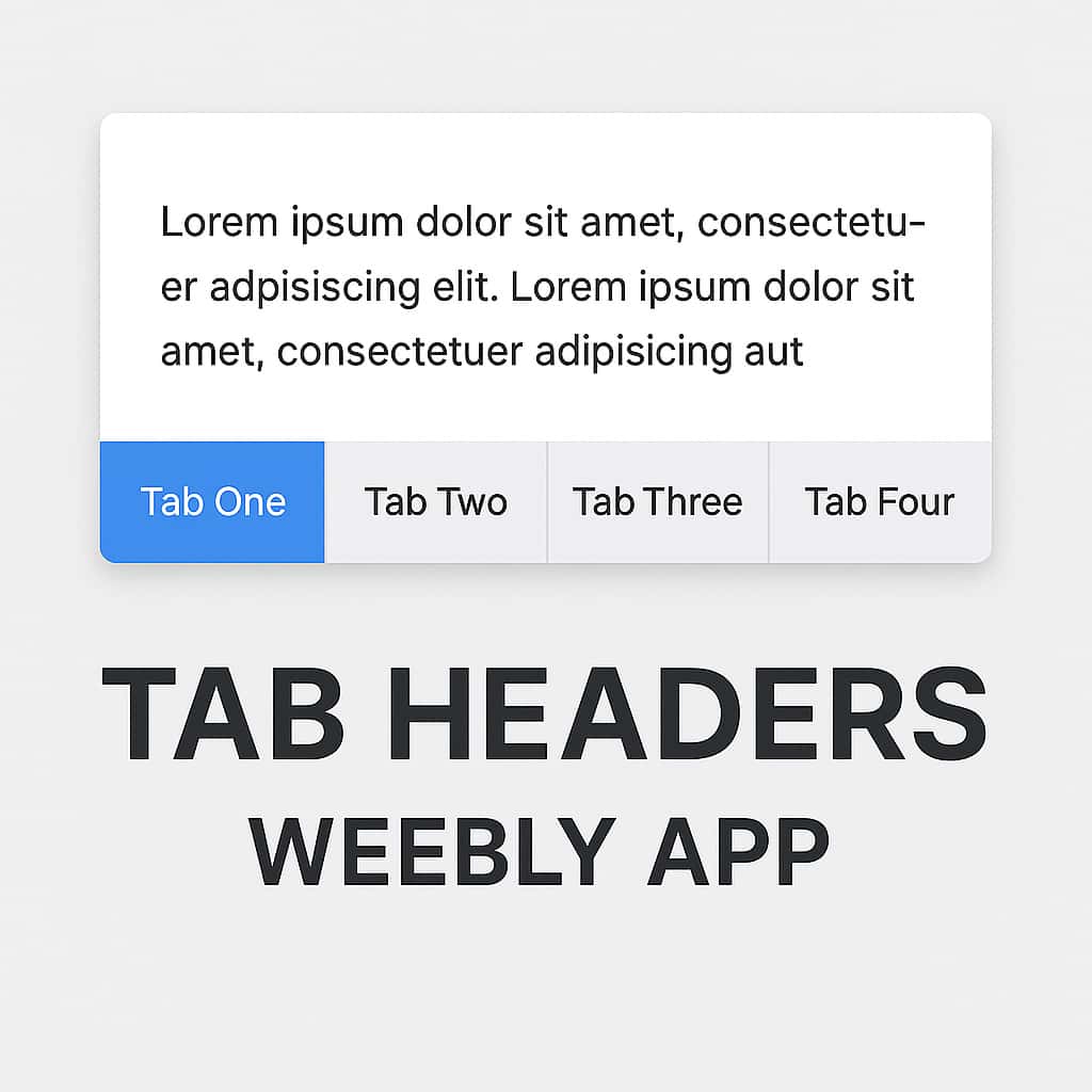
Tab Headers is a Weebly widget that creates responsive tabbed layouts with an inverted structure: the content panel is displayed above the tab navigation links, rather than below them as in a conventional tab widget. This layout puts the focus immediately on the active content and uses the tab row at the bottom as a navigation bar — giving the page a clean, menu-like feel that works especially well for content-heavy sections where you want the text or media front and centre.
Like the other tab widgets from codoplex.com, each tab’s content area is a full drag-and-drop Weebly zone — you can drop any standard Weebly element (text blocks, images, buttons, videos, columns, and more) directly into each tab’s content section without touching any HTML or embed codes.
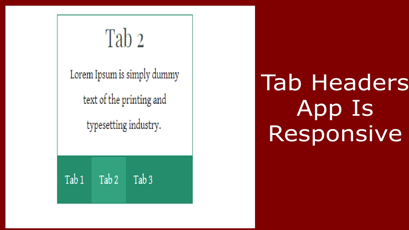
A key advantage highlighted by users is its mobile behaviour: Tab Headers stays horizontal on smaller screens rather than collapsing into an accordion layout. The tab row wraps and stacks overflow tabs below rather than reformatting the entire widget — making it a strong choice for pages with many tabs or for audiences who browse primarily on mobile. Seven colour settings are available from the settings panel for full visual customisation.
Screenshots
Tab Headers in use on a Weebly page — content-above-tabs layout, colour styling, and drag-and-drop content sections.
What Can Go Inside a Tab?
The tab content area is a full drag-and-drop Weebly zone — not a plain text field. Each tab can hold any combination of standard Weebly elements, giving you the same content-building flexibility inside a Tab Headers widget as you have on a regular page.
📝
Text & Rich Content
Add paragraphs, headings, formatted lists, and styled text blocks into the content panel above the tab navigation. Ideal for FAQ answers, product specifications, service descriptions, or any written content where you want the text immediately visible without the tab labels getting in the way first.
🖼️
Images & Media
Drop Weebly image elements directly into tab content areas above the navigation. The layout puts visuals prominently at the top of the widget, making it well-suited for image-led sections such as product galleries, portfolio showcases, or media-rich lookbooks where images should lead.
🔘
Buttons, Columns & More
Add Weebly buttons with call-to-action links, multi-column layouts, maps, contact forms, and other Weebly widgets. Since the content area is a native Weebly drop zone, any element that works on a regular page works inside Tab Headers — including nested tab instances with their own unique IDs.
💡 How to add content to a Tab Headers widget: In the Weebly editor, after placing the widget on your page, click into the content panel at the top of the widget — this is the drag-and-drop zone. Use the Weebly element menu on the left to drag in text blocks, images, or other elements just as you would on any other section of the page. Click each tab label at the bottom of the widget to switch to that tab’s content area and populate it independently.
Design Options & Settings Panel
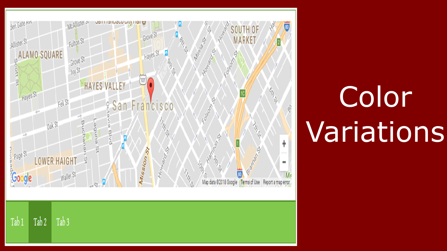
Tab Headers provides seven separate colour settings, giving you independent control over every visual aspect of the widget — from the inactive tab labels through to the content panel’s border and text colour. All settings are accessed from the widget’s settings panel in the Weebly editor and take effect immediately, so you can preview changes before publishing.
Three-state tab styling — default, hovered, and active — gives visitors clear visual feedback about which tab is currently selected, and which tabs are available to navigate to. This three-state system makes the navigation bar at the bottom of the widget intuitive even when there are a large number of tabs.
The settings panel also includes a Unique ID field. When placing multiple Tab Headers widgets on the same page, each instance must have a different ID to ensure the tab switching logic works independently per widget. See the FAQ below for details.
⚙️ Settings Panel
- 🔤 Tab text colour
- 🟦 Tab section border colour
- 🎨 Tab background colour
- ✅ Active tab background colour
- 🖱️ Hovered tab background colour
- 📋 Content section border colour
- 📝 Content section text colour
- 🔑 Unique ID (required per widget instance)
Common Use Cases
Tab Headers is especially effective where content should be immediately visible on page load and the tab navigation acts as a secondary wayfinding tool — rather than a prominent header row that competes with the content itself.
📦
Many-Tab Product Pages
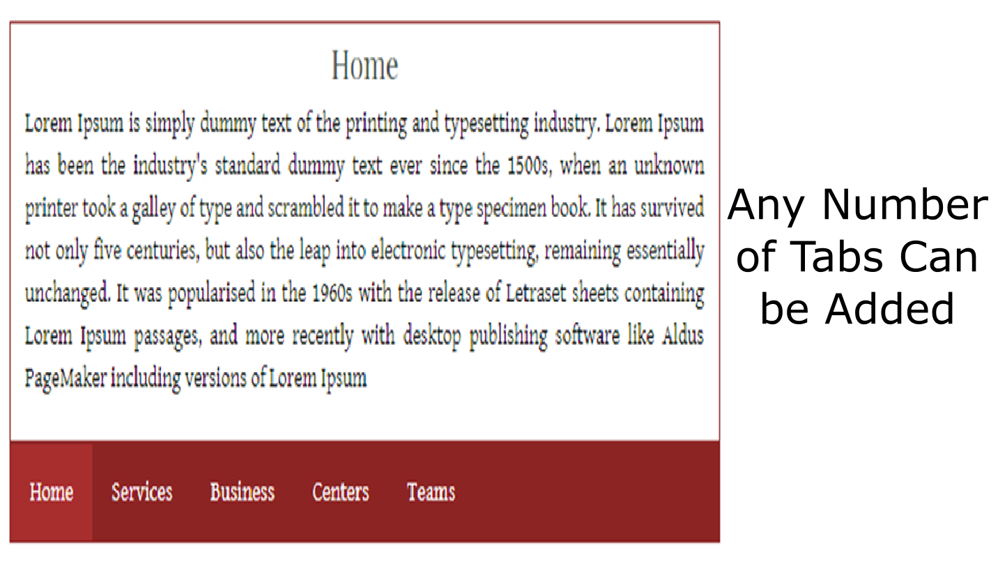
Tab Headers handles large numbers of tabs smoothly — one user reported running 21 tabs (with 2 nested tabs each) with no performance issues in the editor. This makes it a reliable choice for catalogue pages, extensive product ranges, or knowledge bases where many sections are needed on a single page.
📱
Mobile-First Content Sections
Unlike many Weebly tab plugins that collapse to a vertical accordion on mobile, Tab Headers stays horizontal — wrapping overflow tab labels below rather than changing the layout structure entirely. If your audience is primarily mobile and you want a consistent tab experience across devices, this behaviour is a significant advantage.
🗂️
Content-Led Categorised Sections
Any scenario where content should dominate and the navigation should be subordinate. Portfolios, lookbooks, event schedules, categorised FAQs, or multi-topic resource pages all benefit from the content-above layout: the visitor sees the information first and uses the tab links to move between categories at their own pace.
Reviews
Tab Headers has one review on the Weebly App Center — shown below in full. The listing does not display an aggregate rating as the review count is below the minimum threshold. We recommend evaluating the app through the live demo before purchasing.
⭐⭐⭐⭐⭐
Chris Williams Jan 4, 2019 · 5★
“Great product. I found alot of other tab plugins are horizontal and then turn into this gross accordion layout on mobile. While good for some they weren’t for me. This one stays horizontal on mobile for around 3 tabs wide, then stacks the rest below. I have 21 tabs and 2 tabs within each of those and it still runs really smooth when editing in weebly, other products freeze up and load for minutes at a time. 5/5 great work!”
ℹ️ This review highlights two standout characteristics of Tab Headers: it remains horizontal on mobile devices rather than collapsing to an accordion, and it performs well in the Weebly editor even with a high number of tabs and nested widget instances.
Frequently Asked Questions
What makes Tab Headers different from other Weebly tab widgets?
The defining characteristic is the layout: with Tab Headers, the content panel is displayed above the tab navigation links, not below. In a conventional tab widget (including Codo Tabs and Vertical Tabs from the same developer), the tab labels appear first and the content panel is below or beside them. Tab Headers inverts this — visitors see the content immediately on page load, and the row of tab links sits at the bottom acting as a navigation bar. This is particularly effective when the content itself is the primary focus and the tab labels are intended to serve navigation rather than orientation. The second key difference, noted by users, is that the tab row stays horizontal on mobile rather than collapsing to a vertical accordion.
Does Tab Headers stay horizontal on mobile, or does it collapse to an accordion?
Based on user feedback, Tab Headers stays horizontal on mobile — the tab row displays approximately three labels wide and stacks overflow tabs below, rather than reformatting the entire layout into a vertical accordion. Many Weebly tab plugins convert to an accordion on small screens, which changes the navigation experience significantly. If you need tab behaviour to remain consistent across desktop and mobile, this is a notable advantage. Use the live demo on a mobile device to verify the behaviour for your specific number of tabs before purchasing.
How many tabs can I create, and does performance suffer with large numbers?
The listing does not specify a maximum tab count. A verified user reported running 21 tabs with two nested Tab Headers instances inside each one, and found the widget still performed smoothly in the Weebly editor — noting that competing products froze up under that load. While 21 tabs is an extreme case, this is encouraging evidence for use cases that require a larger number of sections. Usability on the published page will depend on screen width and label length, so testing the live demo with a representative number of tabs is advisable if you need many sections.
Can I nest Tab Headers widgets inside each other?
Yes — since each tab’s content area is a native Weebly drag-and-drop zone, you can place additional Tab Headers widget instances inside the content area of a parent tab. The user who reviewed the app used exactly this configuration: 21 parent tabs each containing 2 nested Tab Headers instances. Each nested instance must have its own unique ID in the settings panel to avoid JavaScript conflicts. See the next FAQ for guidance on using the Unique ID field.
Why do I need a Unique ID, and how do I set it?
The Unique ID in the settings panel is how the widget’s JavaScript identifies which set of tab navigation links controls which content panel. If two instances on the same page (including nested ones) share the same ID, clicking a tab label in one widget may trigger the wrong widget, causing unpredictable switching behaviour. The fix is simple: open the settings panel for each Tab Headers instance and enter a different value in the ID field — for example “th-1”, “th-2”, “th-1-a”, “th-1-b” for nested setups. Each widget will then switch content independently and correctly.
Explore Our Other Weebly Apps
Put the Content First. Let the Tabs Follow.
Tab Headers gives you a native drag-and-drop tab layout where the content panel appears above the navigation links — keeping visitor attention on what matters. It stays horizontal on mobile, handles high tab counts without slowing down the editor, and lets you drop any Weebly element directly into each content section. Check the live demo first to see the widget in action, then add it to your site.